I am reposting a quick hybrid tutorial I made for the write.click.scrapbook blog.
I ventured into scrapbooking from the digital side and, while I still do all-digital pages, now I also love incorporating digital designs in my paper pages.
Digital designs are so easy to use. They can be as simple as adding an overlay on top of your photos, or they can be used to jumpstart the page's design, like in the example I will show today. What I really like about it is that I can plan my page on the computer before committing to paper.
The start: on the computer
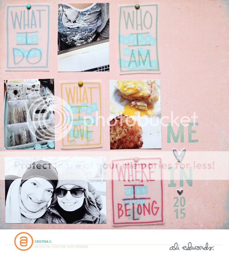
For this page, I used a set of digital brushes by Ali Edwards called Who What Where Why Boxes. I was inspired by this set of brushes to make a page about me, so I selected four boxes that would help me tell the story. I laid them out on my canvas in Photoshop, and picked four photos to go along with them. I also changed the color of the boxes. I laid everything out in a nice grid design.
This could very well be a digital page as is, and could be completed by adding some simple journaling. Instead, I decided to turn it into a hybrid page -- this means that I printed out the digital elements and my photos, and combined them with some papers and embellishments from my stash.
Print
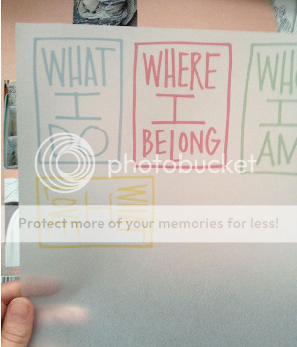
I print everything at home - it's so much easier for me to be able to go from computer to paper in one click and a few seconds. I recently got a new printer and I like the quality of the prints. For this page, I wanted to add some texture, so I decided to print the digital brushes on vellum paper. I printed the photos on photo paper.
Match with other supplies
Next, I picked a neutral background paper from my stash (by Basic Grey). I also used some letter stickers (Simple Stories) to add a few words under each box. I used colored brads to attach the vellum boxes to my page.
I stitched down the letter stickers with my sewing machine. At first, when I laid out my page on the computer, I was planning to make an 8.5"x11" page. But then, after placing the photos and boxes on the background, I liked the white space on the side, and decided to keep it and add a stamped title.
And there you have it!
I love the texture that these boxes add to my page with the see-through effect.
And now.. I'd love to hear from you! Do you incorporate digital designs in your pages? Leave me a comment and let me know!


Question... In you rolling rack picture- where did you get the plastic bin that is holding all of your stamps?
ReplyDeleteThanks!
IKEA
ReplyDelete