Friday evening, instructions:
- You can choose any number of pics, but make your main pic BIG
- Your background paper must be a primary color—red, blue, yellow (any shade)
- I want some blocking squares—at least four.
- Let’s see a bracket (or two), use it/them anyway you like
- Add any elements you want, but you must have one element cluster
- Use an alpha somewhere on your LO other than the title
- Title/date/journal/shadow to your heart’s content

Credits:
Welcome Home and asterisk from Brown Alpha by Erica Zane
Font: Pea Roni Script
Welcome Home and asterisk from Brown Alpha by Erica Zane
Font: Pea Roni Script
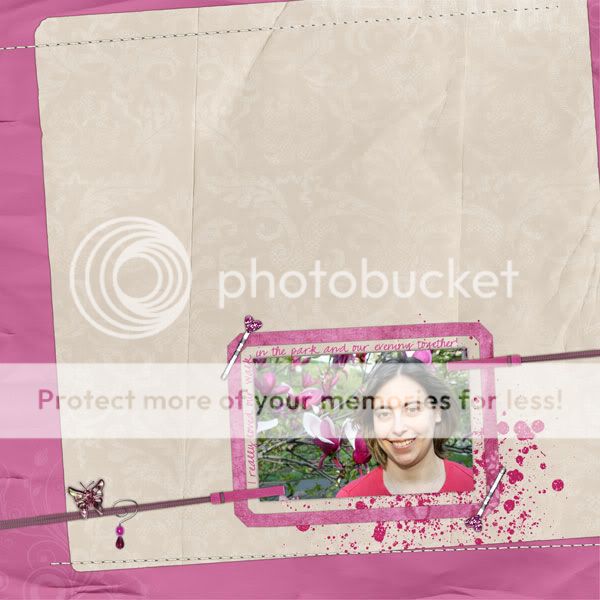
Saturday morning, instructions:
- Choose your pictures, but YOU must be in at least one of them.
- As many (or few) papers as you’d like, but at least one of the major papers must be worn or aged. (That means the worn paper can’t be just a snippet or mostly hidden)
- Add a border to at least 2 sides OF YOUR LAYOUT. Paper, stitches, trims, doesn’t matter, but give your LO a border on at least 2 sides.
- Hang your picture.
- I want to see three different metal elements. That means the same staple repeated three times doesn’t count.
- NO TITLE!
- Embellish as you wish. Don’t forget to add shadows AND journaling!

Credits:
Background paper and other pink paper, butterfly and beads from Magical Escape, worn paper and stitches from Serenity Now
Hang in There v. 2, Glitzy Spills and Thrills, pin from I'm a Dreamer by Britt-ish Designs
Background paper and other pink paper, butterfly and beads from Magical Escape, worn paper and stitches from Serenity Now
Hang in There v. 2, Glitzy Spills and Thrills, pin from I'm a Dreamer by Britt-ish Designs
Saturday afternoon, instructions:
- We are going to start differently today. We are picking kits first. Choose a kit that is different from one you would normally use...maybe different colors…different elements…something that will stand out from the rest of your gallery.
- Choose multiple photos…arrange them however you want -- on the same side of your layout.
- Choose however many papers you want…but your main paper (the one we see the most of) must have a pattern.
- The word for choosing your embellishments is layering. Choose whatever embellishments you want…and layer them up. When working with layers…think 3D…flattest stuff on the bottom (glitter, paint, etc)…and puffiest stuff on top (curled ribbons, flowers). Really think about your shadows too.
- Select everything on your page (except the background papers) and make them a little smaller and move them over a little (whichever direction your want – up, down, left, right).
- Use an alpha for your title…but you cannot arrange your title in a straight line.
- Journal…a little or a lot. Date and save.
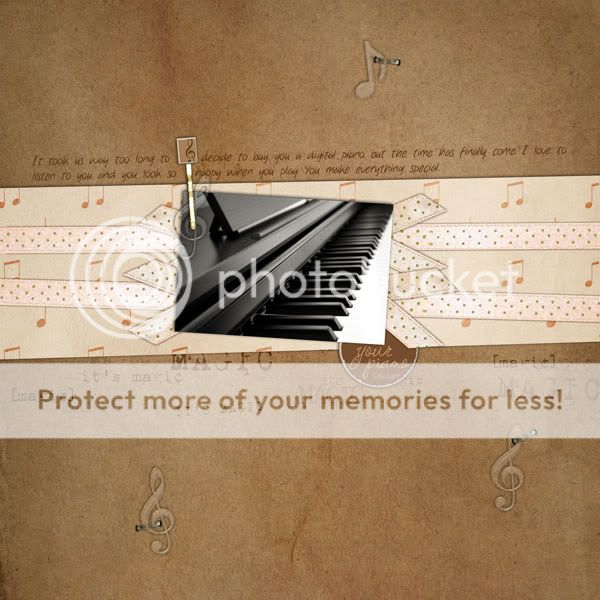
I didn't actually complete this one because after instruction #5 was posted DH came home and I had promised we would go and buy him a digital piano, so I stopped and finished the page after we came home. ;)

Credits:
Prestige and Holiday Prestige by mgl Scraps
Font: Pea Roni Script and Fluoxetine
Prestige and Holiday Prestige by mgl Scraps
Font: Pea Roni Script and Fluoxetine
Then I did a matching page too:

Credits:
Prestige and Holiday Prestige by mgl Scraps
Prestige and Holiday Prestige by mgl Scraps
Saturday evening, instructions:
- OK ladies...we are going to KIS (keep it simple) tonight. In the spirit of Queen of Scrap and the many many pages you all have been churning out, we are going to do a simple page. I want to see clean, simple, neat pages. Instruction #1 is to pick 1 or 2 photos.
- Choose and use only 2 papers.
- Use one element repeated many times on your page. They can be different sizes and colors, but the same basic element. Example, hearts sprinkled that are different colors and sizes, but all hearts. (you can also use other elements)
- Use at least one staple on your page. I almost never haver a page without a staple, they are my favorite! Get at least one on there please.
- Use wordart on your page, doesn't have to be the title.
- Since the rest of our page is simple, use a fun font in your title to add some interest. I mean not regular Times or Arial, something fun or funky.
- Date your page. Journal if you like, but I am not requiring it this time. Usually I always journal, but since this page is simple, you can leave it off. Sometimes the picture and title say it all.

Credits:
Music & Lyrics, edge 2 edge wordart II by Britt-ish Designs
Staple from Natural Wonders by the Scrap Matters Design Team
Fonts: Note this, Pea Stacy Doodle's Script
Music & Lyrics, edge 2 edge wordart II by Britt-ish Designs
Staple from Natural Wonders by the Scrap Matters Design Team
Fonts: Note this, Pea Stacy Doodle's Script
I'd been wanting to use this mini kit by Britt for a long time, and I finally had the right pics! ;)
I skipped the Sunday afternoon speed scrap because I was on a scrapping roll on my own, but I couldn't miss the grand finale Sunday evening.
Instructions:
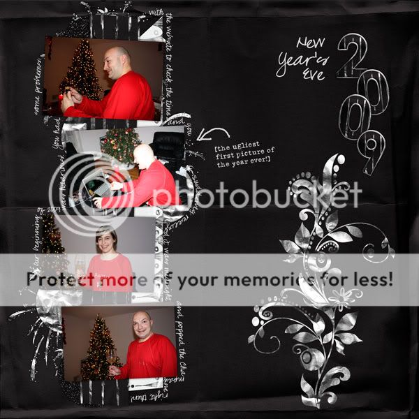
- Our QOS contestants have been reaching way back in their stashes to make their LO’s. So follow their lead and choose photos that are at least 2 months old. As many as you want, as long as it’s more than one.
- One of your photos must be crooked, the others straight.
- One solid, one patterned paper.
- Cluster your elements in one corner.
- The majority of your elements must fall off the page. Put two near your crooked picture.
- Can you say alpha? Use on somewhere on your page..doesn’t have to be the title.
- That’s it! Shadow, journal and date.

Credits:
Reindeer Games by Ziggle Designs
Font: Pea Olson
Reindeer Games by Ziggle Designs
Font: Pea Olson
OK I must admit I'm not very happy about this page.. It turned out a bit cluttered.. I think these pics didn't go well with the instructions but I didn't want to go back and start over. :)
There's a bunch of LOs from the weekend I haven't posted yet, but will soon.


No comments:
Post a Comment